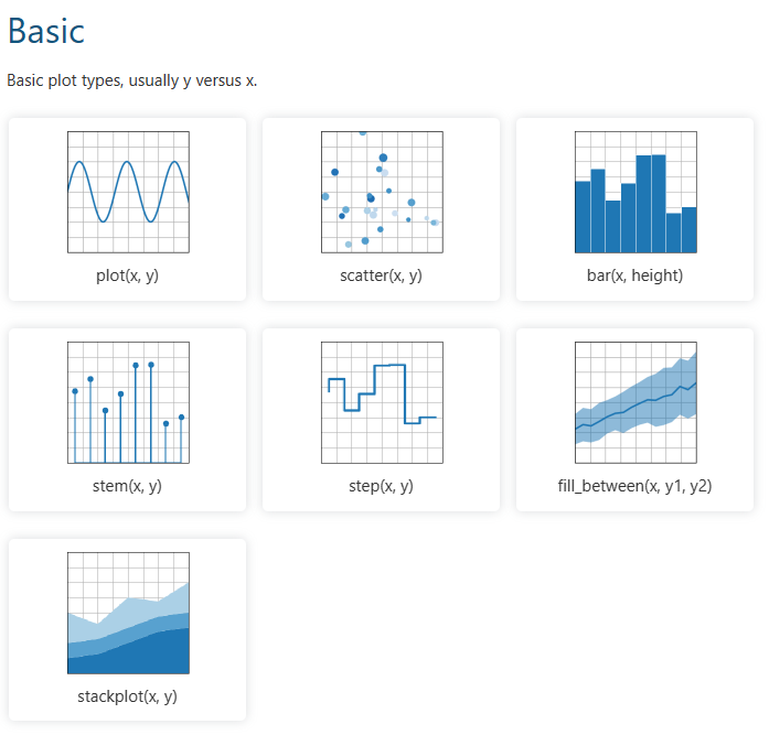
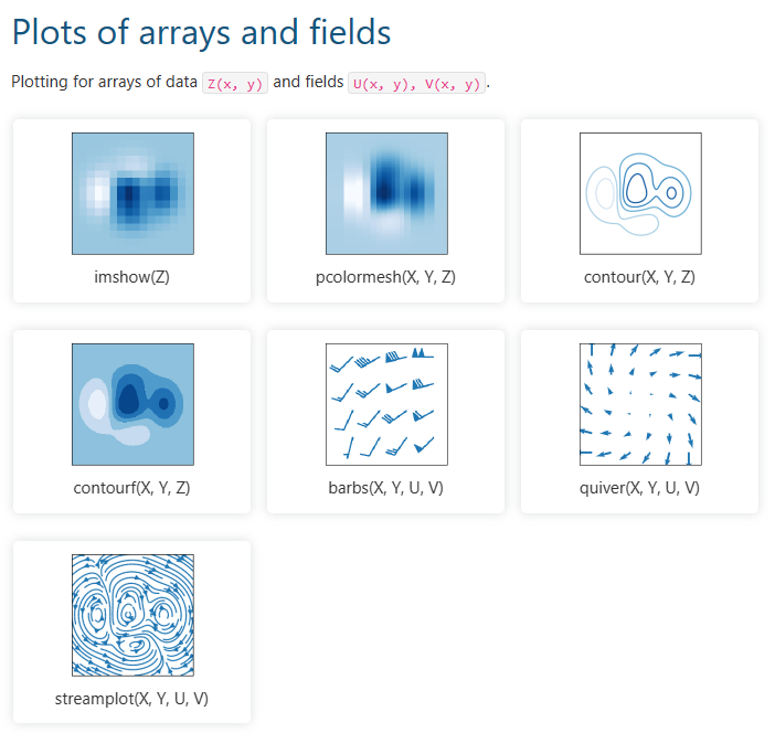
图的类型 Plot Type
折线图的绘制
import matplotlib.pyplot as plt

date_lst = [1,2,3,4]
stock1 = [4,8,2,6]
stock2 = [10,12,5,3]

##折线图 Line Chart
plt.plot(date_lst, stock1)
plt.plot(date_lst, stock2)
plt.show()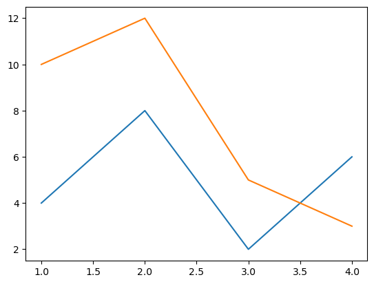
配置图形参数 Configure the plot
# line-format = '[marker][line][color]'

#add red circle marker line
plt.plot(date_lst, stock1,'ro--', label = 'Stock:abc')
#add blue triangle_up marker line
plt.plot(date_lst, stock2,'b^--', label = 'Stock:def')
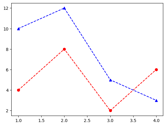
check the matplotlib website for more info about parameters
plt.title("Line Chart")
plt.xlabel("X Label - Time")
plt.ylabel("Y Label - Price")
plt.legend() # 添加图例 add legend
plt.show()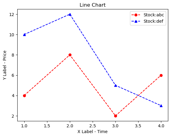
General introduction about data charts
Today, many fields use large pools of data as databases. It can be hard to analyze the data when it’s raw. To better understand how data is distributed, we may use data visualizations. In this topic, we will take a look at the ways to visualize categorical data and compare them with each other with the matplotlib library in Python.
What is categorical data?
Engineers use numerical values to develop machine learning algorithms. As algorithms generally involve calculations, it is more logical to use numeric values. But often, datasets contain various (not only numeric) values. As an example, we can take an employee table. This table can have string values such as nationality, gender, and department. They are called categorical data.
Categorical data can be of two different types: ordinal and nominal. Suppose you are hiring a new employee for a company. Before an interview, you learn about the employee’s nationality and gender. These types of data do not infer an inherited relationship. So, you cannot compare the data with each other or use them as a unit of measurement. That is why they are called nominal data. On the other hand, you can evaluate an employee’s performance during the interview. You can evaluate the employee performance as “not sufficient”, “sufficient”, and “top-notch“. These evaluations are related to each other and called ordinal data.
Bar plot
Today, a bar plot is probably the most popular graph when visualizing categorical data. A bar plot can display categorical data as rectangular bars. In the examples, we will use transportation modes to show categorical data:
transportation_models = {
    "WALK": 23, "BIKE": 11, "CAR": 15,
    "TRAM": 12, "BUS": 8, "TRAIN": 12
}

models = list(transportation_models.keys())
number_of_people = list(transportation_models.values())
We’ve defined two lists that keep the modes’ names and the number of people from the dictionary transportation_models. Now, let’s look at our graph.
import matplotlib.pyplot as plt

plt.figure(figsize=(6, 4))
plt.bar(models, number_of_people)
plt.title("Number of people who use each transportation model")
plt.xlabel("Number of people", fontsize=15)
plt.ylabel("Transportation models", fontsize=15)
plt.show()
From the graph above, we can easily see the distributions among the transportation modes. However, as the numerical difference between BIKE and TRAIN decreases, the plot may be hard to understand. But if you opt for plt.barh() instead of plt.bar(), you will get the horizontal view.
In this way, it is easier to observe the difference between BIKE and TRAIN.
It is a good idea to keep these nuances in mind with bar plots. Another useful tip would be to use color reasonably. For example, you can use three different colors when analyzing the salary of your employees. If the salary is well above the average, you can use green, and if it is below, you can use red. For the rest, you can use the gray color. In this way, you can easily observe the difference between the employees. Also, sorting your data from the largest to the lowest will make it easier for you to analyze.
Stem plot
Another plot that is similar to the bar plot is the stem plot. It marks an endpoint of the data and produces a less complex graph. Now, let’s look at the code:
import matplotlib.pyplot as plt

plt.figure(figsize=(6, 4))
plt.hlines(y=models, xmin=0, xmax=number_of_people, color="blue")
plt.plot(number_of_people, models, "o")
plt.title("Number of people who use each transportation model")
plt.xlabel("Number of people", fontsize=15)
plt.ylabel("Transportation models", fontsize=15)
plt.show()
As we can see in the code, we can get this graph by adding one more line. We used the plt.hlines() method to display our data horizontally. If you want a vertical plot for analysis, use plt.vlines().
Pie chart
You can also visualize categorical data in circular form with a pie chart. This chart contains multiple segments. Each segment represents different categorical data. Generally, showing these segments by percentage will facilitate the analysis. In addition, it does not have axes. Now, let’s draw a pie chart using our data:
import matplotlib.pyplot as plt

plt.figure(figsize=(6, 6))
plt.pie(number_of_people, labels=models, autopct="%1.1f%%", textprops={"fontsize": 15})
plt.title("Number of people who use each transportation model", fontsize=16)
plt.show()
Since we only had six different values, it was quite easy to visualize them. However, as our data increases, an analysis may be challenging, as the area per segment will decrease. The pie chart has no axes with a round structure, so it can be hard to observe changes over time. In addition, showing the data as a percentage instead of numerical values may complicate the analysis. So, it makes more sense to work on datasets with few categories when using a pie chart.
Treemap
Another visualization method similar to a pie chart is Treemap. However, this structure does not use a circular graph. Instead, segments are represented by rectangles. First, we need to install the squarify library to use Treemap. We can do so by using the pip install squarify command. Now, we can draw our Treemap:
import matplotlib.pyplot as plt
import squarify

plt.figure(figsize=(10, 6))
squarify.plot(
    sizes=number_of_people,
    label=models,
    value=number_of_people,
    color=["#F8B195", "#F67280", "#C06C84", "#6C5B7B", "#355C7D"],
    text_kwargs={"fontsize": 15},
)
plt.title("Number of people who use each transportation model", fontsize=17)
plt.axis("off")  # Turn off the axis view
plt.show()
We used the squarify.plot() method while performing the visualization. Unlike the methods above, we assigned the colors manually. Since axes are not used in the treemap, we switched them off with the plt.axis() method. This is what our plot will look like:
We have shown our categorical data and their numerical values in rectangles.
Treemap can support large pools of categorical data because it displays the data as rectangles. In addition, the analysis can be much easier as it shows the data in numeric rather than percentage values. However, Treemap has some drawbacks. Treemaps do not use axes. So, we need to carry out the analysis visually. Also, as the data increases, colors can become overwhelming.
Conclusion
In this topic, we’ve learned how to display categorical data. We’ve covered two forms of categorical data. While ordinal data is interdependent, this connection does not exist in nominal data. In addition, we’ve observed that visualizing bar charts horizontally drastically improves the analysis. With a pie chart, we’ve indicated how the increase in the categorical data can affect visualization. Finally, we’ve shown that using numerical values in Treemaps rather than percentages found in a Pie chart can facilitate analysis.
Now let’s move on to the practice.